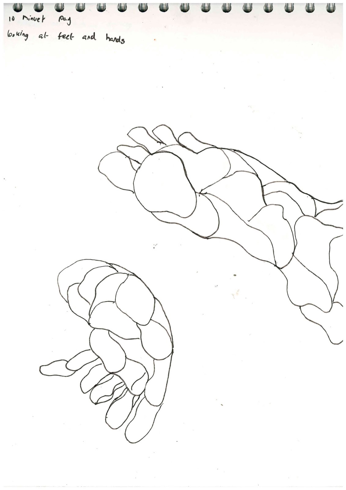
We was given a brief called 'one white shirt' which linked in with our textiles project because we was also given another brief called 'denim project' with these two side briefs combined this became the textile project.
One White Shirt
This was the first of the two briefs we was given in our textile project. The phrase 'One White Shirt' was the only thing we was told other than being shown some example where we could take this brief to a final outcome. so this lead onto researching and gaining visual influences off the internet i.e Pinterest, google and just everyday shopping websites.
During this brief I was getting my University offers and interview dates, so I had to get my portfolio ready so this project took a step-back due to the rush to get my portfolio finished. However I would not just be fully focusing on my portfolio as a class we were being given demonstration of different textiles techniques over the couple of weeks.
Screen Printing


These are a couple of the screen prints I did during the workshop using just one colour and powder. i feel like the red print works better because the powder is more evenly spread out and gives the print a more exciting look/effect. The more vibrant colours are working better for me because they are more appealing to the eye.
Mono printing

This was a quick experiment that i did during the workshop we did as a class. For this experiment i did not pick a specific pattern to try and draw i just used my imagination and see what the outcome would be like. The outcome has been successful because there is no pattern its free and loose but effective within the marks that have been made.
It was getting to the deadline for the 'One white shirt' to be fished and due to the amount of time i had been putting into my portfolio I hadn't got much experimentation work to show for this brief however I wanted to get a final outcome based on the experimentation I had done during my time. so I fond that the screen printing worked better for me and I could have more control over it because I could create a stencil for the print. So I was going to stick with the same theme of cars as I have done because this concedes with my University course and that is the theme that runs throughout my portfolio and I would keep that going into my brief. So i made a stencil that was based off my car and to trial it i didn't go straight onto a shirt i see what it would look like i used photo shop and trailed some colours.


Then once i had trailed them and found that the stencil works and look clean and professional so i would go with the stencil and screen printing so i moved onto printing onto 'one white shirt'.

Denim project
so the second part of the textile project was using denim i.e. trousers, shirts and anything that was made from denim. However we was advised to use trousers to experiments with. Just like the "one white shirt' project we had we was shown where we could take it but we had to go out a do research on artist. just like the other project we was shown techniques in workshop how we could manipulate the denim. We was shown you can screen print on them, sew into them by hand or machine, rip and tear and bleaching.
Bleaching
with the bleaching I didn't just go straight in with bleach I layered the denim with glue because I wanted to have a shiny finish left on the denim afterwards. While the glue was setting this is where I started to added the ink and the beach onto the glue so that was setting everything else was soaking into the denim.


Sewing
I used the sewing machine to do sewing onto the denim where I kept overlaying different coloured treads over each other to create texture on the denim. I used the offcuts of the denim that id my bleaching on and once I ran out of them I changed the colour denim.


I used my sewing for my final piece but i used them as a serious and I didn't use the sewing themselves. I used the photo and overplayed them as a camouflage over pictures of my car to stay with the theme of my project through.