Wednesday, 10 May 2017

Textile Project

We was given a brief called 'one white shirt' which linked in with our textiles project because we was also given another brief called 'denim project' with these two side briefs combined this became the textile project.

One White Shirt 

This was the first of the two briefs we was given in our textile project. The phrase 'One White Shirt' was the only thing we was told other than being shown some example where we could take this brief to a final outcome. so this lead onto researching and gaining visual influences off the internet i.e Pinterest, google and just everyday shopping websites.

During this brief I was getting my University offers and interview dates, so I had to get my portfolio ready so this project took a step-back due to the rush to get my portfolio finished. However I would not just be fully focusing on my portfolio as a class we were being given demonstration of different textiles techniques over the couple of weeks. 

Screen Printing


These are a couple of the screen prints I did during the workshop using just one colour and powder. i feel like the red print works better because the powder is more evenly spread out and gives the print a more exciting look/effect. The more vibrant colours are working better for me because they are more appealing to the eye. 

Mono printing


This was a quick experiment that i did during the workshop we did as a class. For this experiment i did not pick a specific pattern to try and draw i just used my imagination and see what the outcome would be like. The outcome has been successful because there is no pattern its free and loose but effective within the marks that have been made. 


It was getting to the deadline for the 'One white shirt' to be fished and due to the amount of time i had been putting into my portfolio I hadn't got much experimentation work to show for this brief however I wanted to get a final outcome based on the experimentation I had done during my time. so I fond that the screen printing worked better for me and I could have more control over it because I could create a stencil for the print. So I was going to stick with the same theme of cars as I have done because this concedes with my University course and that is the theme that runs throughout my portfolio and I would keep that going into my brief. So i made a stencil that was based off my car and to trial it i didn't go straight onto a shirt i see what it would look like i used photo shop and trailed some colours. 


Then once i had trailed them and found that the stencil works and look clean and professional so i would go with the stencil and screen printing so i moved onto printing onto 'one white shirt'. 


Denim project


so the second part of the textile project was using denim i.e. trousers, shirts and anything that was made from denim. However we was advised to use trousers to experiments with. Just like the "one white shirt' project we had we was shown where we could take it but we had to go out a do research on artist. just like the other project we was shown techniques in workshop how we could manipulate the denim. We was shown you can screen print on them, sew into them by hand or machine, rip and tear and bleaching. 

Bleaching

with the bleaching I didn't just go straight in with bleach I layered the denim with glue because I wanted to have a shiny finish left on the denim afterwards. While the glue was setting this is where I started to added the ink and the beach onto the glue so that was setting everything else was soaking into the denim. 


Sewing  


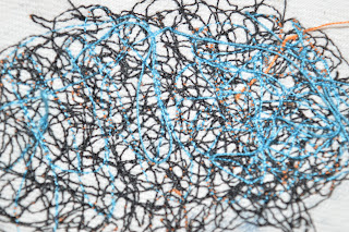
I used the sewing machine to do sewing onto the denim where I kept overlaying different coloured treads over each other to create texture on the denim. I used the offcuts of the denim that id my bleaching on and once I ran out of them I changed the colour denim. 


I used my sewing for my final piece but i used them as a serious and I didn't use the sewing themselves. I used the photo and overplayed them as a camouflage over pictures of my car to stay with the theme of my project through. 


Ian Liddle


·      He is a British artist but he lives in Berlin.
·      His work is known as painter and graphic artist.
·      He has wide range of art techniques: drawing, painting, printing, photography, sculpture, collage, observation and life drawing.
·      He has worked for many musical artists as an illustrator.

·      He does not just work on small scale like he does murals for clubs, bars and hotels in his local community.


we was given a brief to look at three artist but we had to choose one that we like to research and experiment on. so looking at his style of work and i got inspired to take this digitally. As I have done for the other briefs. I am still using Liddle's style of work but in my own style so took some portrait photos of people in my class so i could work over and experiments with. 


we was given a brief to look at three artist but we had to choose one that we like to research and experiment on. so looking at his style of work and i got inspired to take this digitally. As I have done for the other briefs. I am still using Liddle's style of work but in my own style so took some portrait photos of people in my class so i could work over and experiments with. 


i did some simple overlaying experiments with the images to see how they would turn out which kept in line with my abstract theme. however i feel like they didn't work very well because the outcome does not have very much resemblance to the artist because there is not any bright colours like he uses. 


With these photos I used Photoshop in my experiments which i chose sections of the image/faec to select and then i filled the selected area in a vibrant colour just like Liddle does. I did this to cover the hole face which gave the face an abstract look but it was still noticeable to pick out features from the face. however from these experiments not just the colour experiment came from this i also got some abstract drawings of faces due to the colour experiments. I feel like the colour experiments have worked ok but not great because they look simple and not as high quality as i wanted them too this could be due to the colours that i have selected and the positioning of the colours. however the most successful part of the experiments are the drawings i have gained from these experiments because this then lead into my life drawing because this became the style I draw the life model in. 


Nel Ten Wolbe Brief


This was a brief that we were given to research the artist. once we had done our research we created an installation as a class and he had to take inspiration from the installation based on the artist. The artist Nel Ten Wolbe is a New Zealand. She uses her pictures she has taken when she goes on walks because she is a very spiritual artist and person, however she does not just use her pictures to create the compassion she draws over the pictures and around the ripped off bits to create a flow between the photographs. she likes to use a lot of colour but she does not class herself as an colourist because she feels that could gives the compassion the edge that she wants. I do not like the collages where use just uses pictures within the compassion because it is only using on medium and i feel her work using multi-mediums works better because they have more of a flow and brings out her imagination more.

(http://www.neltenwolde.com/outback-collages?lightbox=image_1lfq) on this link for her website with all her collages on i like the “outback 6 collage “ the most because i like how there is more than medium being used and the main focus is the picture but your eye gets draw to the contract in colour of the charcoal joining the picture together.

For this experiment i have tried to recreate one of Wolbe piece but in my own style. I used Photoshop CS6 and a Wacom tablet to trace and paint with brush tool in photoshop with using single brush strokes to achieve my final outcome of the experiment. this experiment has worked well because you can see the resemblance between my experiment and her work.

These are a few experiments that i have taken inspiration from Franz Kline and Nel Ten Wolbe using my installation photos. I have used Photoshop to overlay the photos over each other then I changed the opacity so the bottom image can show through the top image. I feel like the experiment have not worked as well as they could have with better photos because they are the bases of the experiments so they would give a better outcome. 

Textile Project

We was given a brief called 'one white shirt' which linked in with our textiles project because we was also given another brief cal...